Project Scope
Let's take a look at the project prompt presented by Cognizant.
Across the world, airports are continually updating their experience for staff and guests personalized wants, innovative experiences and security needs. However, airports have yet to truly implement high-tech and high-touch experiences for guests. Many airlines are looking to improve upon their check-in experiences. With the rise of technologies, as well as health and safety needs, the time is right to reconsider how airlines and guests interact at this pivotal moment in the airport.
- "How could an airport check-in experience be improved with innovative technologies?"
- "How would guests and staff be able to interact effectively with passengers?"
Research
Preliminary Insights
Looking at published research and literary resources, we found the following statistics most insightful. This pointed us down the path of designing around the check-in experience.
Check-in methods
From 2015 to 2021, there was a 22% increase in self-service check-in methods

Self service technologies
However, from check-in onwards, related activities drop off in self-service usage.

Our team deduced that while certain check-in methods allow users to plan and skip the line, they require the use of personal technology.

Requires personal technology + general knowledge
No personal technology + knowledge, but requires waiting in line
We then sent out a survey to our community to learn more from traveler's past experiences and expectations of the check-in process. With 43 responses, the following trends emerged:
Planning Ahead
Frequent and infrequent travelers alike prefer checking-in in advance to mitigate potential issues and for peace of mind.
Low Confidence
Travelers expressed self-doubt when checking a bag, unsure if there are extra fees or if they are even in the right place.
Wait Times
Frustration around wait times occurs around activities that rely on employee interactions.
Ethnography
Getting onsite at some airports, we noticed travelers experiencing...

- Confusion in Self Categorization
- "Which line do I join?"
- Unfamiliarity with Self-service Kiosks
- "How does this technology serve my needs?"
- Panic in Required Documents
- "What will the agent need to see?"
- Annoyance at Baggage Lines
- "Why do I need to wait again?
- Anxiety in Holding up the Line
- "This isn't working, what do I do?"
Check-in was also run a bit differently between the various airlines. Our team mapped out the common floor layouts we saw.
Type A
Open floor plan for kiosks, less structure in line formation
Type B
A self-service + employee hybrid
Type C
One long line for kiosks and the bag drop counter
Type D *
Multiple help desks and different aisles
*Because we are based in Atlanta, Georgia, it's important to note that it is a Delta Hub, thus more space and resources are allocated for Delta with the given floor layout. However, Type D is not exclusive to Delta, as other cities' main hubs follow this layout as well.
After observing travelers and employees, we created a flow chart to model the current check in process, and what steps are taken at each stage.

Personas by Mindsets
Our team put together different travelers' mindsets from our preliminary research. These are meant to help envision who is going to be using our system, how they would interact with it, as well as how they interact with each other.

The Planner
Knows exactly what needs to be done in the airport, tech savvy and willling to use new tech

The Last Minute
Has not done any pre-work before arrival, not familiar with tasks to complete

The Independent
Likes to problem solve on their own, values minimal contact with employees or other travelers

The Help Seeker
Prefers asking for help when confused, likes the reassurance of an employee doing the work for them
Design
Design Opportunities
With this background, we started to develop opportunity areas that lay at the intersection of our project scope and what is lacking in the current state.
Space Allocation
The same check-in processes between airlines can have difference experiences based on the layout of physical touch points.
Baggage Drop Off
Currently, Baggage Drop requires employee attention and accounts for increases in wait time and physical traffic.
Wayfinding
Travelers unfamiliar with the check-in process or with non-standard needs often struggle with knowing where to start.
How might we...
- Connect the airline agent and traveler’s mental models of responsibilities at the airport?
- Create a seamless experience with the layout of physical touch points?
- Minimize the negative impact of travelers with edge cases on others in line?

Brainstorming
Focusing on the physical aspect of our project, we generated concepts surrounding the Baggage Drop Off and Wayfinding opportunity areas.
Ideation
After rounds of sketching, iteration, and critique, our team finalized our initial concept made of three major components. We observed that guests who needed to physically check-in most often had baggage to drop. Therefore, our solution focused on this aspect of the flow.

Single Bag Drop Kiosk

Multi Bag Drop Kiosk

RFID Bag Tags
To bring these concepts together into one system, we designed the layout of each of these touch points in a check-in area floor plan. The goal is to create different sections that travelers can use according to their mindset and their goals.

User Testing
We created two life-sized kiosk models and ran usability tests to observe participants checking in a bag without any assistance. We printed our UI and attached to each model to provide users with instructions.
Kiosk A
Pros:
- A lower opening prompts users to lay luggage flat
- A flat top offers a temporary shelf
Cons:
- The screen placement and overall form obstructs access to the luggage conveyor belt
Kiosk B
Pros:
- The form is spacious for larger bags
Cons:
- The large vertical opening suggests luggage can be placed vertically
We also tested 4 different variations of bag tag attachment methods:
Finally, we recreated the physical space in an atrium with mock touchpoints. We then recruited participants and gave them a scenario with different goals to accomplish, observing how they interacted with our proposed floor plan and how they affected the overall flow of traffic.
Observations:
- A lack of signage caused congestion at the entrance where the only signage was placed
- Most people lined up for the help desk, even when their goals could be completed without assistance
Outcome
Final Concept
Based on our initial research, ideation, and testing, our team finalized a final design for a self-serve bag drop, a color coded bag tag, and a comprehensive floor plan to maximize efficiency in the check-in area.

- Travelers can check their bags themselves without having to wait in two lines
- Each kiosk is equipped with depth sensing cameras, based off the Kinect Azure model to accurately scan, measure, and validate checked bags
- RFID technology allows for easy scanning, even if the barcode is obstructed from view, and for information to be updated in real time
- Color Coded Bag tags allow a clear signifer as to where to join the sticky areas

- Color coded signage placed for higher visibility aids travelers with triaging themselves to the right area based on their goals
- The self-service sections leave space for float staff to assist travelers if questions arise
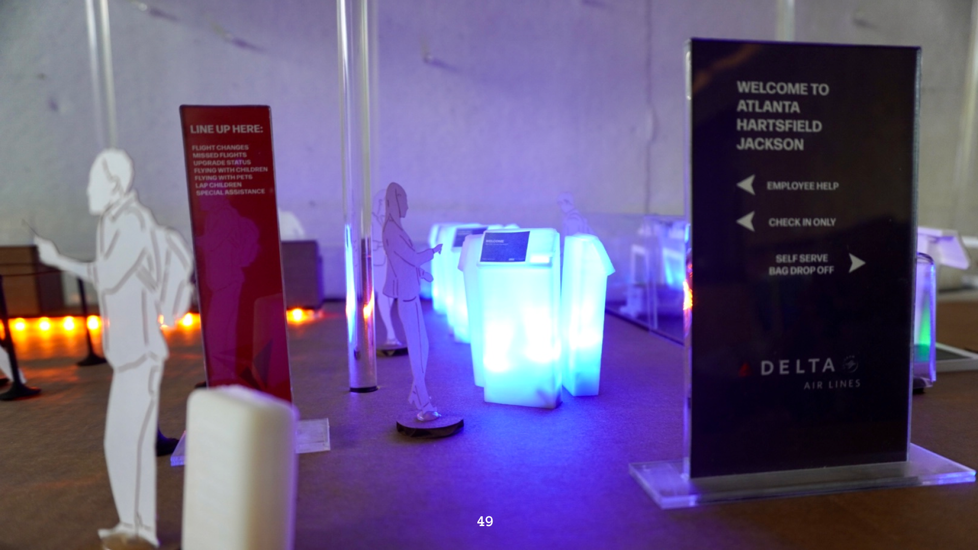
Physical Model
We created a mini model to visualize the system as a whole. The model was complete with 3D printed help desks, check-in kiosks, single and multi bag drop kiosks and luggage. Different types of check-in methods are color-coded with an LED system to match our signage and help with way finding.
User Journey
Walkthrough an example of how one traveler uses our self-check in system with luggage.
Thanks for flying with us!

Meet the Crew
This project was an amazing success and I couldn't have done with without my teammates. Over the course of this project, we were also guided by stakeholders at Cognizant and our professor Noah Posner. Together, they helped us create a project that was highlighted at Georgia Tech's design showcase, Launchpad, with our physical model still on display to this day.


.gif)


.gif)

.gif)